
Optimizing the user experience for better conversions.
Swing Therapeutics creates evidence-based digital treatments to help people with chronic conditions live their best lives.
At Swing, an early-stage startup based in San Francisco, my role within the product team was instrumental in shaping the evolution of the company’s brands and enhancing user experiences across digital and physical channels and multiple touchpoints. In this instance, I collaborated with the product, marketing, engineering, and clinical teams to redesign the company’s website.
My role
As a visual designer, I was responsible for bringing the website to life by turning the low-fidelity mockups into high-fidelity designs, evolving the design system, introducing responsive design best practices, preparing dev-ready files, and conducting quality assurance. I also participated in the website structure and content development brainstorming workshops and low-fidelity mock-up design reviews.
Skills
UI Design, Design Systems, Responsive Design, Accessibility, Visual Design, Branding, Design Thinking, Presentation, Documentation, Dev-ready files, Communication, Problem-solving, Project Management
Tools
Figma, Zeplin, Jira, Asana, Slack, Zoom, Adobe (Illustrator & Photoshop), and Pen & Paper
Team
2 Designers, 1 Product Manager, 1 Marketing Director, and 3 Software Engineers
Overview
-
Swing needed to update its website to align with its new commercialization phase, making the message and positioning clearer for the relevant stakeholders — clinicians, investors, payers, and potential patients. The goal was to generate new clinician leads and patient referrals for the partner telehealth clinic.
It needed to incorporate relevant content and calls to action and potentially announce a significant accomplishment: the FDA approval of Stanza, Swing’s digital therapeutics app for treating fibromyalgia symptoms.
-
I was tasked with turning the low-fidelity mock-ups into high-fidelity designs, ensuring the website look and feel was on brand, and the user interface was easy to use.
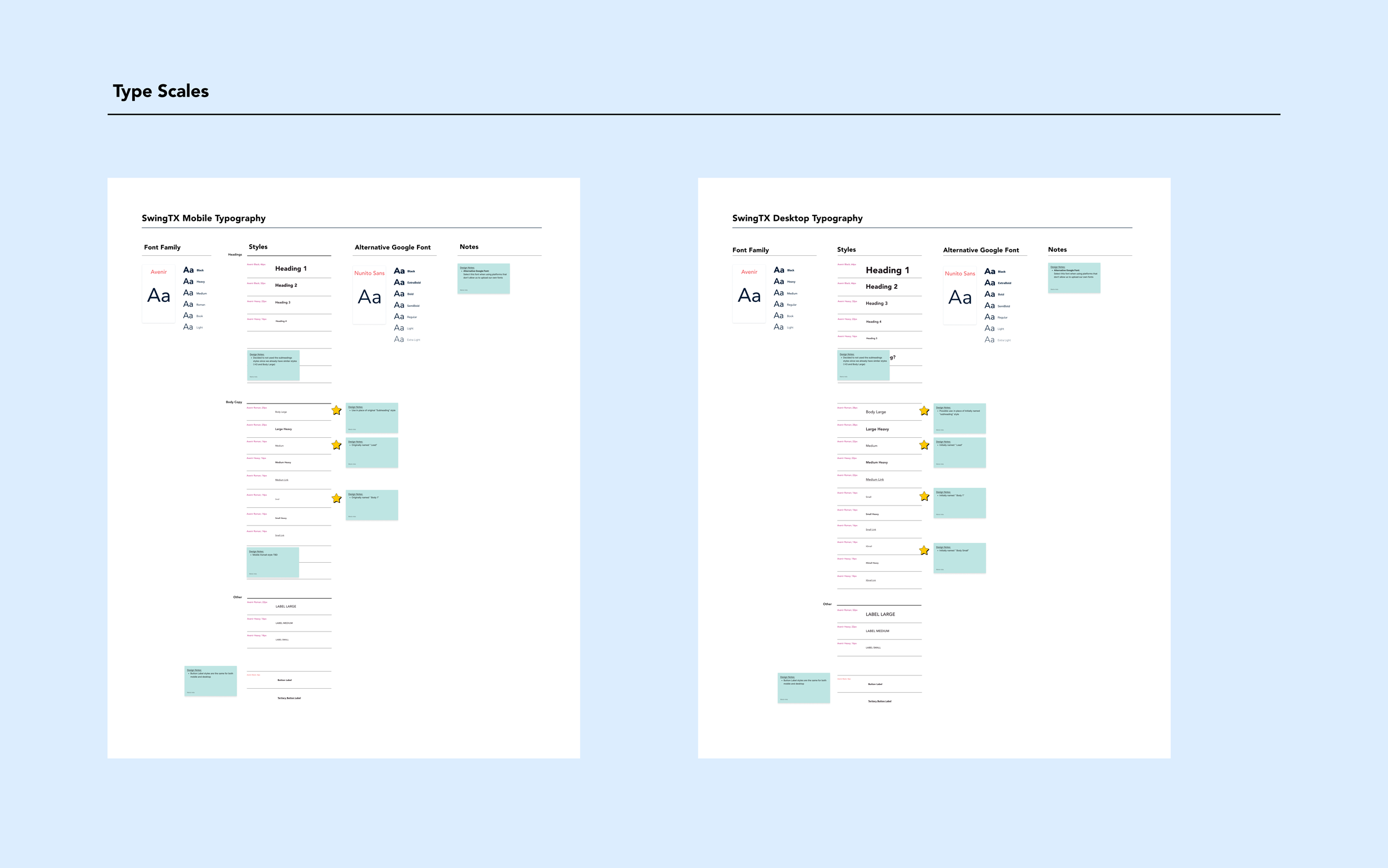
We had a minimal design system consisting of a small type scale, a few colors, and only one breakpoint. So, part of the effort included evolving the design system to allow for a responsive website, an intuitive experience, a stronger information hierarchy, and the design of charts and infographics.
-
We began with brainstorming sessions to identify audience segments and their goals and pain points and to discuss the website content and structure. Once aligned, the Marketing Director developed the content, and the Senior Product Designer created the initial low-fidelity mock-ups.
I worked in parallel with the Senior Product Designer. While she was working on the low-fidelity mockups, I expanded and iterated the design system to include multiple breakpoints, a revised grid, a robust type scale, a color key, and illustrations. I then implemented the design system, creating high-fidelity designs, developing more complex components, and establishing a component library.
I led design reviews, facilitated discussions and iterated based on feedback, engaged with the engineering team early in the process, presented the high-fidelity designs to the leadership team and CEO to get buy-in, and participated in quality assurance.
Impact
🎯Aligned with new strategy
The updated website aligned with Swing's go-to-market strategy, allowing the company to appeal to a new segment (clinicians who may prescribe Stanza or refer to Swing Care). It also incorporated evidence in a way that compelled a clear CTA.
📈Drove clinician engagement
As a result, Swing has generated dozens of leads through the new Clinicians page and has created an experience to more effectively showcase evidence, including a study published in The Lancet in July 2024
🧱Built a scalable design system
The new design system facilitated the development of a responsive and more accessible website, allowed for a stronger information hierarchy, created a solid foundation for future iterations, and served as a style guide for designing marketing collateral.
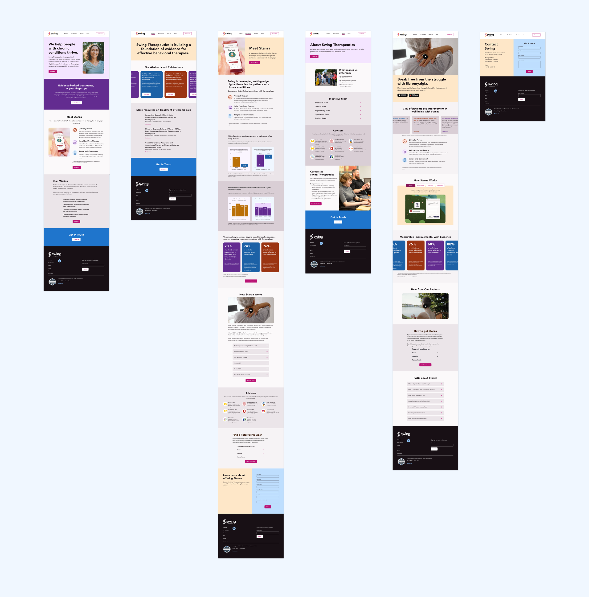
Final Designs

HOME PAGE (STANZA SECTION), EVIDENCE PAGE (PUBLICATIONS SECTION), FOR CLINICIANS PAGE (STANZA SECTION)

ABOUT PAGE (TEAM SECTION), STANZA PAGE (HOW IT WORKS SECTION), CONTACT US PAGE (CONTACT SECTION)

DESKTOP: HOME PAGE, EVIDENCE PAGE

Process
EVOLVING THE DESIGN SYSTEM
Expanding the type scale and color palette
I expanded the type scale by including a wider range of sizes, weights, and styles for a stronger hierarchy. I enlarged the color palette to incorporate additional variants that could be used for different functions. I tested color combinations to ensure accessibility standards were met.
Creating icons, grids, and breakpoints
I created a basic icon set, introduced three new breakpoints, refined the grids and margins, and developed a basic component library to enhance the design system further.
Testing and making adjustments
I started working on the design system while the product designer was focused on the low-fidelity mock-ups. This parallel approach allowed us to assess some elements and make adjustments earlier and later in the process.


Designing components
Designing components was a nonlinear process. Some of the more simpler components, such as buttons were designed earlier on while some of the more complex ones were created while doing the visual design.
Defining micro-interactions
I used component sets with variants to show the different states and ensure seamless user experiences across various interactions. I built them to be easily accessed and edited using Figma’s property section on the sidebar.
Documenting the designs
I organized the components and supplemented them with comprehensive notes, serving as valuable references for both designers and engineers in future iterations.


CREATING THE HI-FIDELITY DESIGNS
Implementing the design system
I worked closely with the Senior Product Designer to bring the low-fidelity mockups to life by implementing the revised design system and ensuring the website was on brand.
Adding illustrations, charts, & photos
Leveraging the visual identity, I created illustrations, designed charts, and selected photos to enhance the look and feel of the website.
Redesigning the blog
We had to redesign the blog because it was glitchy and not responsive. To save time, we used a blog template we designed for another one of our websites and styled it with our design system.

HOME PAGE ACROSS BREAKPOINTS

TOP NAV PAGES | DESKTOP

BLOG + LEGAL INFO PAGES | DESKTOP
COLLABORATING CROSS-FUNCTIONALLY
Working closely with senior product designer
From expanding the design system all the way to QA, I worked closely with the Senior Product Designer testing the design system, addressing issues, asking questions, and bouncing off design solutions.
Presenting and iterating
Throughout our design reviews, I presented the high-fidelity mockups and refined them based on the team’s feedback. This iterative process continued for several rounds until the design received final approval.
Collaborating with engineering
We maintained open lines of communication with the engineering team, regularly sharing our designs and engaging in discussions to address potential challenges and explore viable solutions.
NAVIGATING LAST MINUTE CHANGES

Solving for a shortened timeline
Our timeline was unexpectedly shortened by a month due to an early announcement, pushing us to expedite the visual design phase by delegating tasks.
Last minute content revision
We had to incorporate new content and final edits right before wrapping up the hi-fidelity designs. The Senior Product Designer and I came up with a system to address these last-minute changes as quickly and smoothly as possible.
HANDOFF TO ENGINEERING
Documentation
In preparation for handoff, I organized the files, tidying up layers and adding notes containing links, states, behaviors, and any other relevant information to ensure the receiving team had all the necessary details at their fingertips.
Walkthrough with engineering
Before the handoff, we did a thorough walkthrough with the engineering team, presenting the designs, addressing any potential issues, and addressing questions to ensure a smooth transition to the implementation phase.
Sharing dev-ready files
In collaboration with the Senior Product Designer and Senior Product Manager, we used Zeplin to handoff the final files and components, while also creating and managing tasks in Jira to streamline the development process.

DOCUMENTATION FOR ACCORDION & MODAL STATES

DOCUMENTATION FOR BLOG DROP DOWN MENUE STATES
QUALITY ASSURANCE
Splitting the work
I initially collaborated with the Senior Product Designer to ensure accurate implementation of our designs by dividing the workload by pages and complexity. Later, I concluded the process independently.
Addressing limitations with engineering
We encountered technical limitations with our carousel and form designs, so we met with the engineering team to discuss the issues. We revised the carrousel and form designs to work with the constrains.
Finding balance
Although some of the solutions we came up with during QA were not ideal, they served as a temporary workaround until the next iteration. We added this items to our back log so we could address them later.
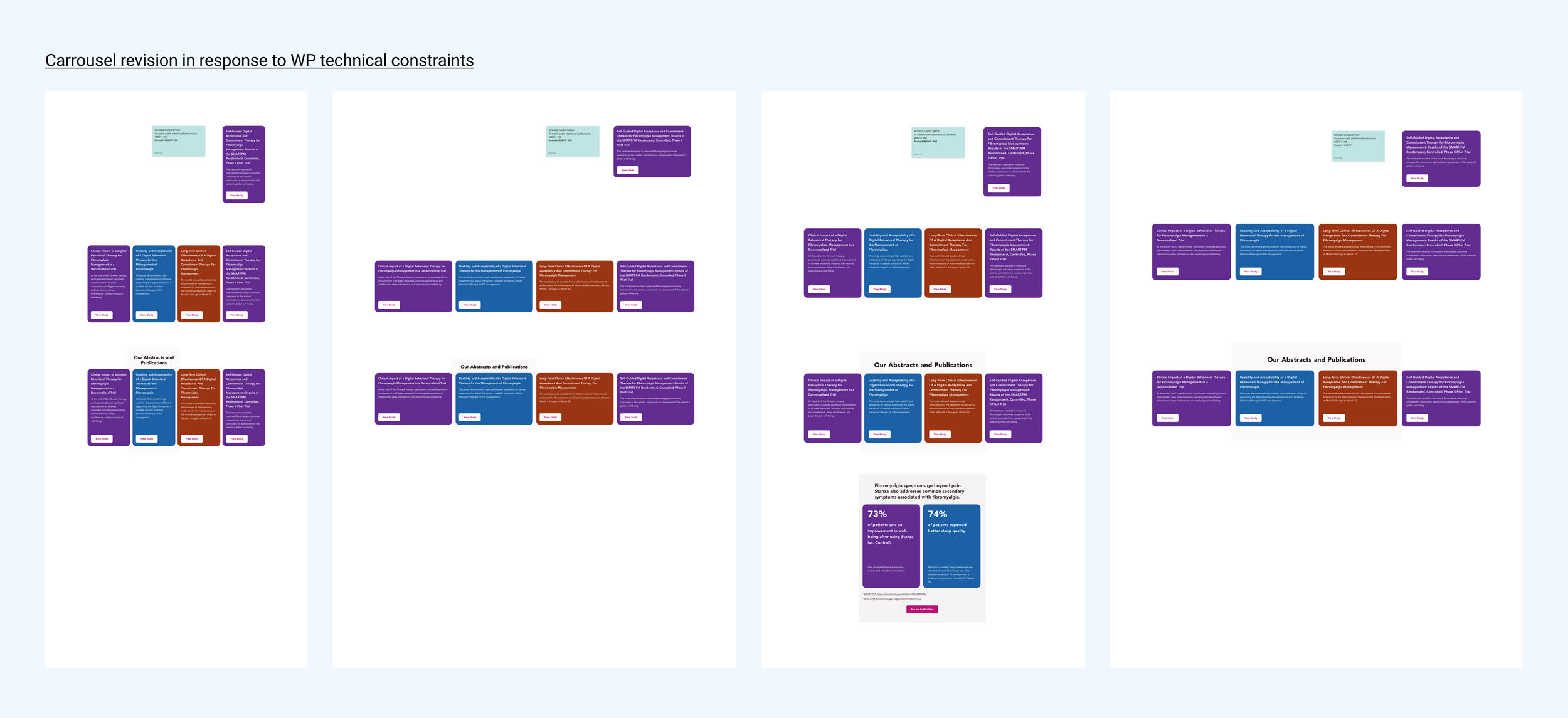
CARROUSEL REVISION

FORM STATES REVISION