Bringing Swing Therapeutics to life at industry events
Swing Therapeutics develops digital therapies that help people with chronic illnesses live their best lives.
At Swing, an early-stage startup based in San Francisco, my role within the product team was instrumental in shaping the evolution of our brands and enhancing user experiences across channels, touchpoints, and formats. I collaborated with a cross-functional team that included stakeholders, product, marketing, engineering, and clinical experts. I partnered with the Marketing Director to build Swing’s physical presence establishing its expertise in the treatment of fibromyalgia.
My role
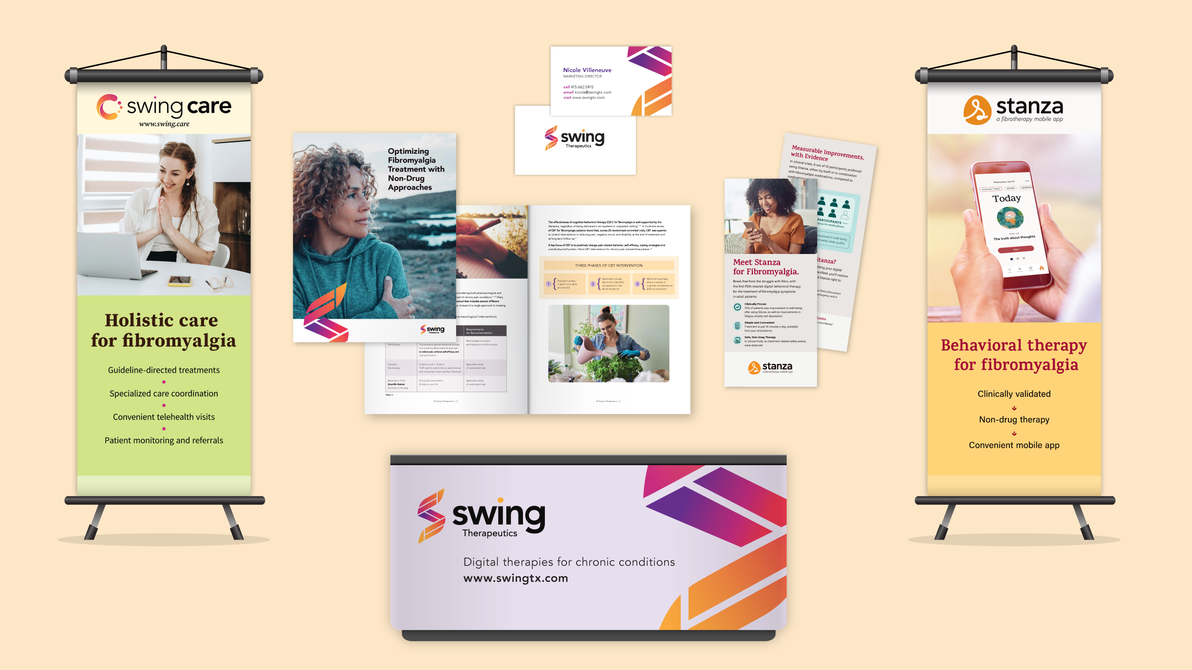
As a visual designer, I was responsible for creating the conference booth and all the marketing materials that were part of it. This included the design of a podium, banners, rack cards, business cards, and a white paper booklet.
Skills
Branding, Visual Design, Design Thinking, Presentation, Communication, Problem-Solving, Project Management, Print Production
Tools
Google Workspace, Pen & Paper, FigJam, Adobe (Illustrator, Indesign, Photoshop, Acrobat), Pantone Color Guide, Asana, Slack, and Zoom
Team
Marketing Director and Myself
Overview
-
As a newcomer in the field, one of Swing’s' goals was to establish the company as an expert in treating fibromyalgia. An essential aspect of the strategy was participating in medical conferences to promote Swing’s digital therapeutic app, Stanza, share evidence from clinical studies, and introduce Swing Care, their new and specialized virtual clinic for fibromyalgia.
-
My challenge was to convey Swing's brand essence across diverse materials while establishing a strong in-person presence. This involved working with three brands, each with its distinct look and feel and without a brand style guide for Swing and Stanza, tight budget constraints, strict deadlines, and concurrent projects.
-
We've opted for a minimalist approach in our choice of items and booth design. This decision allowed us to effectively test our setup, identify areas for improvement, and refine it over time. By utilizing minimal resources, we not only streamlined our process but also ensured adaptability for any potential pivots down the road.
Impact
🌟 Built brand awareness and trust
Attending medical conferences helped Swing Therapeutics build brand recognition and trust among healthcare providers while differentiating itself from other players in the market by highlighting its evidence.
🔍 Opened doors for insight and connection
It provided an opportunity to gain insights from prospective partners, present clinical study results, and spread the word about the company's products and services.
🔗 Generated leads and referrals
It generated potential leads, resulting in our first referring providers to Swing Care, whereas before, we had exclusively direct-to-patient acquisition.

EVENT BOOTH: SWING CARE BANNER (SERVICE)

EVENT BOOTH: STANZA BANNER (PRODUCT)

EVENT BOOTH: TABLE

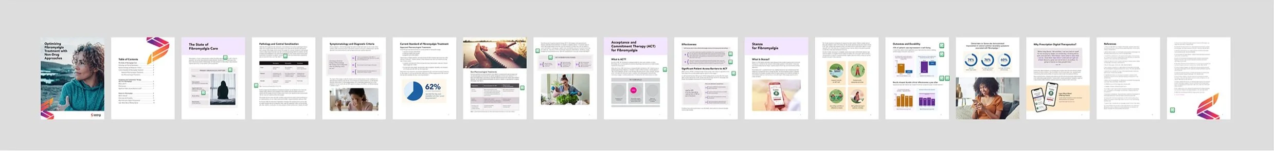
MARKETING COLLATERAL: WHITE PAPER

BRAND COLLATERAL: BUSINESS CARDS

MARKETING COLLATERAL: STANZA RACK CARDS (PRODUCT)

MARKETING COLLATERAL: SWING CARE RACK CARDS (SERVICE)
Process
Banners & Table

UNDERSTANDING THE PROBLEM, RESEARCHING, & SKETCHING
Going over the brief
Before diving into the project, I went over the brief, asking questions and uncovering its nuances. I gained a good understanding of the project, setting a solid foundation for my next steps.
Doing desktop research
Research was the first step in designing Swing’s booth. I dove into understanding the audience, studying competitor booths, looking for vendors, and getting and comparing quotes.
Visualizing the booth
Using wireframes, I explored various layouts and element placements, ensuring the visibility of important information from both near and far distances.


EXPLORING SOLUTIONS
Exploring solutions
Working with multiple brands posed an interesting challenge, as each had its unique identity. To integrate them, I strategically used color and composition resulting in a cohesive visual narrative for the booth.
Presenting, iterating, and aligning on a solution
After a few rounds of design and iteration, we aligned on a solution that addressed the problem while considering our constraints.
Building the final files
When preparing the files for printing, it was essential to conduct black-and-white print tests to ensure the designs looked good at their actual size, were legible both up close and from a distance, and to verify the quality of printed photographs.


PRESENTING & ALIGNING ON ASOLUTION


Business Cards

Exploring solutions
Leveraging Swing’s visual identity, I first explored different designs and layouts and then narrowed them down to fewer options.
Presenting, iterating, and aligning on a solution
I shared the selected designs with the team and iterated based on feedback. We aligned on a solution after a couple of rounds.
Fine-tuning
I then took the additional step of printing samples to refine the details, ensuring that the final design looked great on paper and that all text was easily readable.


Researching vendors
After researching a few vendors for pricing, paper choices, and special treatments, I ultimately decided to move forward with Moo for the paper quality and pricing.
Building print-ready files
After approval, I built the final files in Illustrator, customizing them with individual names and details. Using my good old Pantone color guide, I made sure our colors would print accurately.
White Paper

FRONT COVER & INTERIOR SPREAD

INSIDE COVER & TOC

INTERIOR SPREAD

INTERIOR SPREAD

INTERIOR SPREAD
UNDERSTANDING THE PROBLEM
Going over the brief
Before diving into the project, I reviewed the brief, asked questions, and discussed details. Understanding the project goals, audience, and constraints set a solid foundation for my next steps.
Doing desktop research
I studied white papers from other companies to see how they solved a similar problem and identify what worked well. I also researched vendors, got a few initial quotes, and presented them during the first design round.
EXPLORING SOLUTIONS & ITERATING
Sketches & wireframes
I started by dividing the content into sections and sketching the booklet in my notebook. I then transitioned to FigJam to create wireframes and shared them with the Marketing Director allowing for early input and collaboration and ensuring alignment throughout the process.
Low-fidelity designs
After implementing feedback from the previous round, I moved from wireframes to low-fidelity. I presented the design to the Marketing Director and discussed what was working and not working and why. I then addressed the feedback and continued to refine the design.
Hi-fidelity designs
After a few rounds of presenting and iterating on the low-fidelity designs, I reached a good point to move on to higher fidelity and transition to InDesign.
Design iterations: going from low to high fidelity designs

WIREFRAME

LOW FIDELITY DESIGN

MID FIDELITY DESIGN
HIGH FIDELITY DESIGN 1

HIGH FIDELITY DESIGN 2

HIGH FIDELITY DESIGN | FOR DIGITAL USE

HIGH FIDELITY DESIGN | BOOKLET FOR PRINT USE