
Positioning Swing Care as a leading authority in fibromyalgia care.
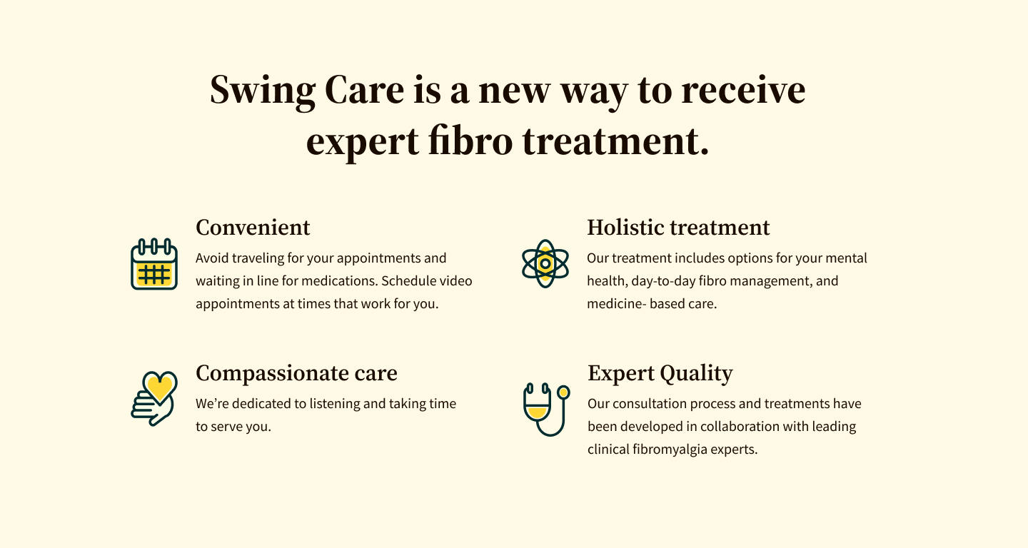
Swing Care is a specialty care practice offering comprehensive, personalized care for fibromyalgia.
Swing Therapeutics is an early-stage startup based in San Francisco. As part of the product team, I played a key role in shaping the evolution of the company’s brands and enhancing user experiences across digital and physical channels and multiple touchpoints. In this case, I collaborated with the product, marketing, engineering, and clinical teams on the brand positioning and the marketing website design for Swing’s new virtual clinic—Swing Care.
My role
As a visual designer, I was responsible for developing the brand strategy for Swing Care, evolving its visual identity, developing a design system, creating high-fidelity designs for mobile and desktop, preparing development-ready files for engineering, and participating in quality assurance.
Skills
Brand Strategy, Workshop Facilitation, Visual Design, UI Design, Design Systems, Accessibility, Responsive Design, Design Thinking, Presentation, Documentation, Design-to-Code, Communication, Collaboration, Problem-Solving, Project Management.
Tools
Figma, Miro, Zeplin, Jira, Asana, Google Workspace, Slack, Zoom, Adobe CC, and pen & paper
Team
2 Designers, 1 Product Manager, 1 Marketing Director, and 2 Software Engineers
Overview
-
When I first joined Swing, the company was gearing up to launch Swing Care, a cutting-edge virtual clinic specializing in fibromyalgia.
While the rest of the company was working on building the virtual clinic, the product team was focusing on the Swing Care marketing website, developing the low-fidelity prototypes for desktop and refining the copy.
Our goal was to position Swing Care as a leading authority in treating fibromyalgia and foster new patient growth.
-
The biggest challenge was creating a trustworthy, compelling new brand in a healthcare space and patient community that was inherently hard to break into.
I was tasked with creating high-fidelity designs and providing development-ready files. The first issue I had to address was the similarity between Swing Therapeutics and Swing Care's visual identities, as one of the project requirements was to visually differentiate them.
The lack of a brand strategy added complexity, requiring me to align the visual elements with a coherent brand narrative that would resonate with Swing Care's target audience.
-
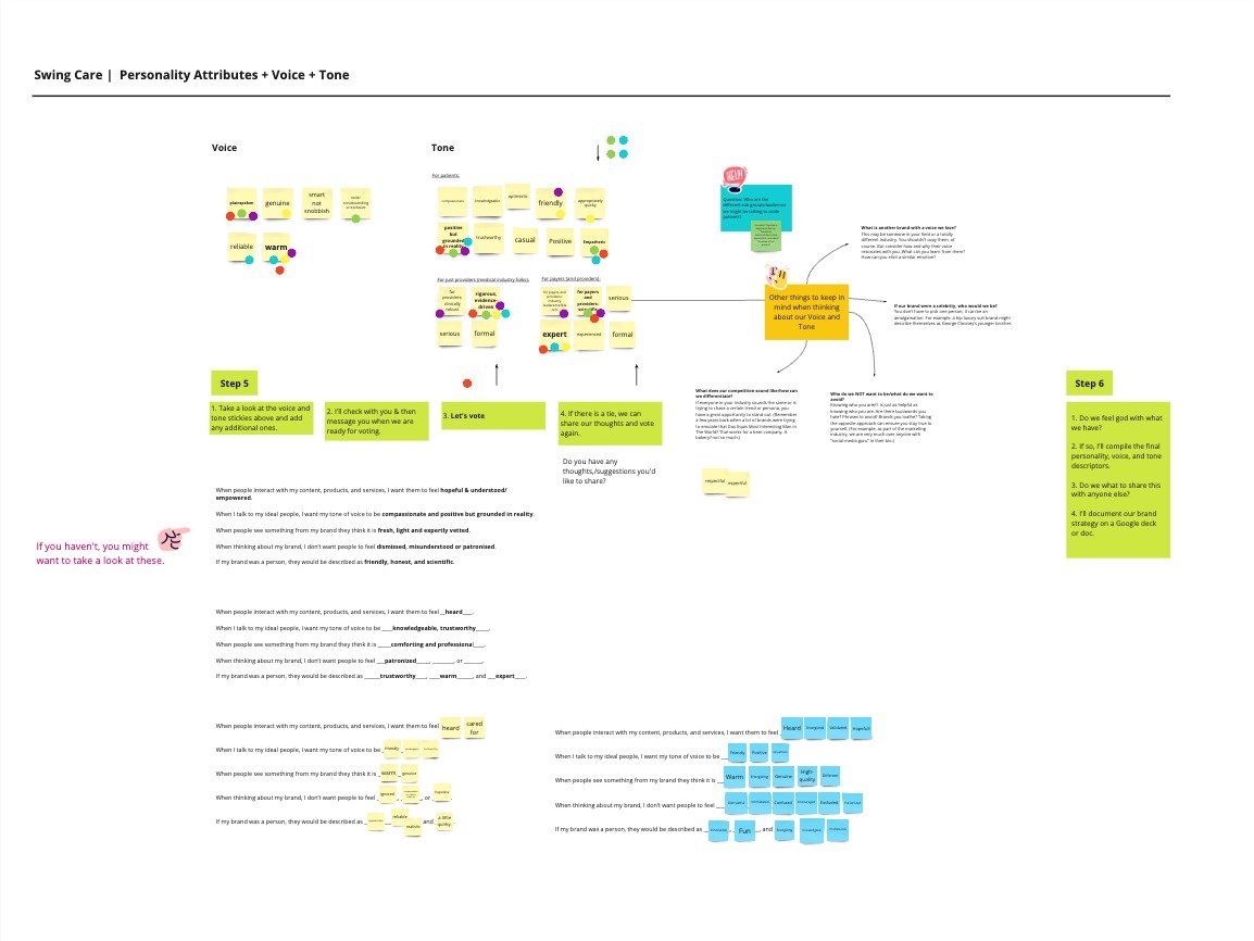
Itook the initiative to define the brand strategy and used it as the foundation to evolve the visual identity and develop a cohesive design system.
Using the insights about the audience, I facilitated workshops with colleagues and leaders from various departments to shape the brand strategy, including mission, vision, values, and personality. This strategic framework guided the creation of the visual identity and design system, breathing life into the website wireframes.
I worked closely with the Senior Product Designer to create high-fidelity designs, advocated for adding a mobile breakpoint, and proposed early collaboration with the engineering team. I presented sample pages to stakeholders to gain early buy-in on the overall look and feel and avoid surprises. Later, I conducted a successful final presentation that garnered approval from the CEO/founder.
Impact
📈 Drove Patient Growth
I developed a comprehensive brand strategy that served as a guiding framework for both the internal team and external vendors. This alignment enabled Swing Care to hit critical patient growth KPIs essential to the business.
🤝 Built Credibility and Trust
The brand strategy unified our efforts and fostered trust with a skeptical audience. A consistent brand presence and intuitive user experience across all channels helped establish Swing Care as a credible, patient-centered clinic.
🚀 Set the Stage for Future Improvements
The first version of the Swing Care website laid the groundwork for testing, iteration, and future improvements. This solid foundation helped launch the virtual clinic, scale from zero to hundreds of new patients per month, and attract partnerships with insurance companies nationwide.
Final Designs

HOME, TREATMENTS, ABOUT, & CONTACT US PAGES

MOBILE PAGES: HOME, TREATMENTS, ABOUT, PRICING, & CONTACT US

HOME PAGE (VALUE PROPOSITION SECTION) & TREATMENTS PAGE (HOW IT WORKS SECTION)

PRICING PAGE (FAQ SECTION) & CONTACT US PAGE (FORM SECTION)

DESKTOP PAGES: : HOME, TREATMENTS, ABOUT, PRICING, & CONTACT US
Process
Leading the Brand Strategy Work
Learning about the audience
I began with a deep dive into understanding our audience and identifying their needs, beliefs, and pain points. This initial step guided the facilitation of live and asynchronous workshops to define a clear and resonant brand strategy.
Facilitating workshops
Using design thinking tools and a brand strategy framework, I facilitated collaborative sessions with the entire company and with just the product team.
Aligning on a strategy
Incorporating insights gathered from stakeholders and workshop outcomes, we aligned on an initial strategy that included the brand personality, mission, vision, and values. My vision was to use this as a starting point and continue to evolve it.


EVOLVING THE VISUAL IDENTITY
Searching, selecting, and pairing fonts
In refining the brand's visual identity, I paid attention to every detail, especially in selecting typefaces that perfectly captured the brand's personality.
I began by choosing several serif and sans-serif typefaces, which I then paired up for headings and body copy. After narrowing down to fewer options, I tested them on a couple of low-fidelity page mockups and selected the final pair.


TESTING TYPE PAIRINGS IN LOW FIDELITY DESIGNS

TESTING TYPE PAIRINGS IN LOW FIDELITY DESIGNS
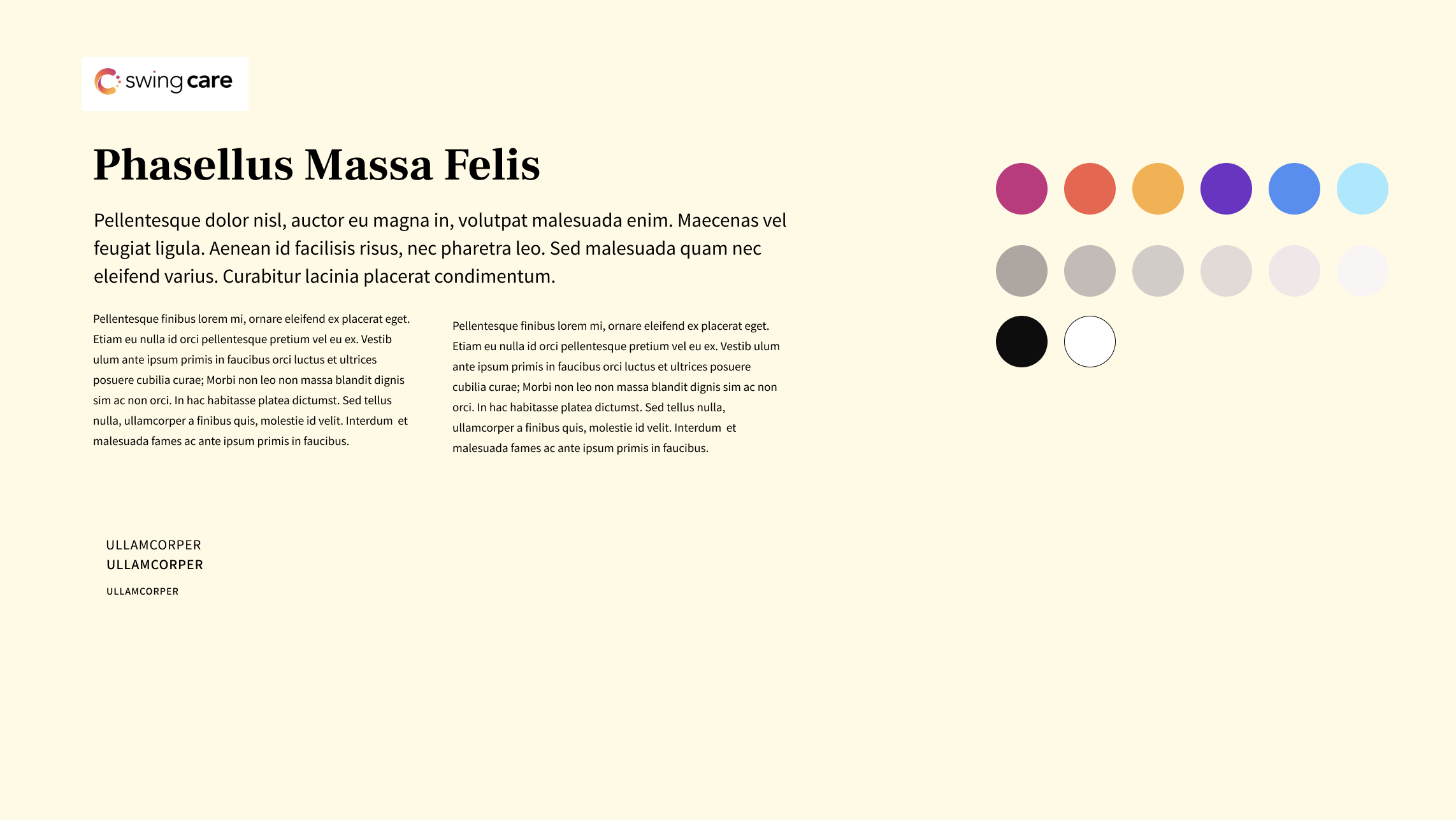
Expanding the palette
I expanded our color palette thoughtfully, selecting hues that complemented the existing colors and aligned with the brand personality. By emphasizing some of the additional colors, I successfully differentiated Swing Care's visual identity from Swing Tx.
Establishing the style
I started by looking at different illustration styles and sets, selecting one that aligned with the brand personality, was easy to recreate, and complemented the other visual identity elements, further enhancing the visual language and storytelling capabilities.
Setting the tone for photography
I selected a photography style that resonated with the audience and complemented our overall aesthetic, reinforcing the brand's identity and creating a cohesive visual experience across all touchpoints. Some of the words used to describe the style were empowered, natural, diverse, in the moment, and honest.


DEVELOPING A BASIC DESIGN SYSTEM

Setting up the color key
Using the revised color palettes as a starting point, I created variants for each color, established neutrals and communication colors, and tested for accessibility.
Establishing a responsive type scale
Using best practices, I selected a type scale ratio that worked well for marketing websites and created the typeface for mobile and desktop breakpoints.
Creating an icon set
Using Material Symbol icons, I experimented with sizes and thickness and then created a starter set.
Designing basic components
I started by creating a button set for light and dark modes.
ESTABLISHING THE OVERALL LOOK
Exploring color usage
I experimented with various color combinations using a couple of sample pages. After presenting them to the product team, I incorporated their feedback to refine the designs, ultimately aligning on a direction.
Adding illustrations and photographs
I selected illustrations from the purchased set and also created new ones, either by tweaking existing designs or by designing them from scratch.
Selecting the photographs
To minimize costs and time, we chose stock photos. We were aware that’s not the ideal, so our vision was to replaced them with photos of our practitioners and patients. The brand personality and established photography style guided our selection process to find the perfect images.


ILLUSTRATIONS

HERO IMAGE EXPLORATION
REFINING AND ITERATING
Creating high-fidelity designs
After establishing the overall look and feel, I implemented it across various pages, fine-tuned the low-fidelity layouts, presented them to the product team, and refined them based on their feedback.
Defining Microinteractions
During this phase, I designed more complex components, establishing their states and behaviors.
Getting Final Approval
I presented the high-fidelity designs of the entire website to the CEO and other stakeholders which were well-received and approved by them.
PREPARING FILES FOR HANDOFF

Adding documentation
To facilitate understanding for the engineering team, I created a dedicated layer in Figma with detailed notes on behaviors and relevant information.
Doing the walkthroughs
We did a few walkthroughs with the engineering team: first during the low-fidelity stage, then again after completing the high-fidelity designs, and finally during the handoff of the finalized files.
Sharing final files
The vendor we were working with just wanted to have access to our Figma file, so that was what we handed off to them.
QUALITY ASSURANCE
Dividing the work
To meet our deadline, we divided the tasks among the product team members.
Sharing feedback
Using the tool provided by the vendor, we provide feedback on the test website.
Good enough to launch
Due to the aggressive deadline, there wasn't much time for fine-tuning, so the approach was to launch and then make improvements as needed.