
Evolving the Stanza brand
Stanza is an FDA-cleared, prescription digital therapeutic that provides Acceptance and Commitment Therapy for the treatment of fibromyalgia symptoms.
Stanza was developed by Swing Therapeutics, an early-stage start-up company based in San Francisco. As part of the product team, I collaborated with product, marketing, engineering, and stakeholders to evolve the Stanza brand across channels and touchpoints.
My role
As the Visual Designer on the team, I revised the logo to reflect the new app name, redesigned the App Store graphics to be more on-brand, and created the first Stanza-inspired swag.
Skills
Design Thinking, Design Reviews, Presentation, Discussion & Facilitation, Communication, Problem-Solving, Project Management, Print & Digital Production, & Remote Collaboration
Tools
Adobe (Illustrator, Photoshop, & Acrobat), Figma, FigJam, Pen & Paper, Zeplin, Asana, Zoom, & Slack
Team
Designer (me), Marketing Director, Engineer
Illustrations by Rafael Varona
Final Designs

STANZA SCREENS WITH NEW LOGO

STANZA APPLE STORE GRAPHICS

STANZA T-SHIRT FRONT & BACK
STANZA LOGO
Overview
Setting
Swing had recently changed the name of its therapeutic app from Tempo to Stanza while the app was live and being used in clinical trials. We were working towards submitting the app for FDA approval, so this logo redesign needed to be subtle and quick.
Challenge
I was tasked with delivering a solution that aligned well with the existing look and feel. The goal was to tackle this quickly so we could keep on moving forward, ideally, without missing a beat.
Approach
We decided the quickest and least disruptive solution would be to revise the existing logo to have the letter “s”, from the Stanza, instead of the letter “t” and swap names.
BEFORE

PREVIOUS LOGO
AFTER

NEW LOGO
Process
EXPLORING SOLUTIONS
Looking for the right “s”
I searched for cursive typefaces and zoomed into the lowercase “s”, selecting a few options and testing them against the background shape.
Making it our own
Once I found a letter “s” I could use as a foundation, I customized it to fit our needs.
An unexpected challenge
The original Tempo logo used a custom-designed font that included only the letters in the word “Tempo”—not a full alphabet. Since the letterforms weren’t available beyond that, we needed to find an alternative solution for the updated logo.


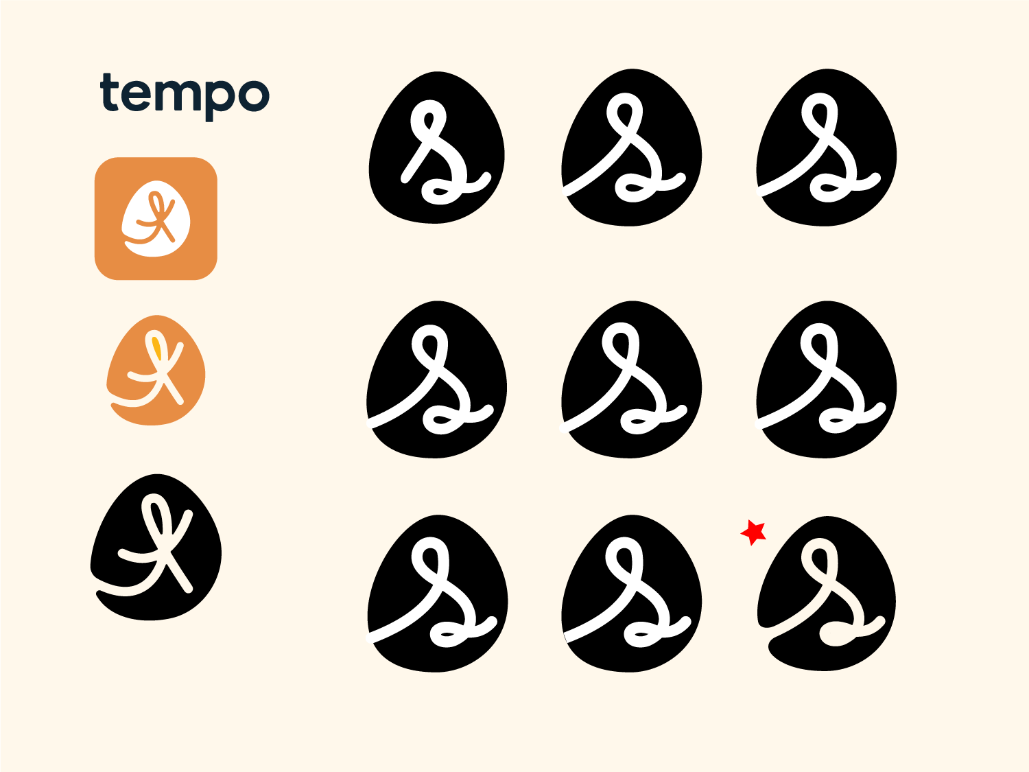


Type studies
When looking for replacement fonts, my goal was to choose a font that closely matched the look and feel of the original and complimented the secondary font and overall design
Iterating
After looking for and selecting a few options and revising the icon to incorporate the team’s feedback, I tested them against the revised icon, selected my top choices, and shared them with the team again.
Aligning on a solution
At this point, we aligned on the typeface but had small refinements to do to the icon.
FINE TUNNING
Working on the Details
After aligning on the typeface for the brand name, I refined the logo by exploring a couple of different weights, sizes, letter spacing, and scales. I then selected the final design and presented for final approval.


FINAL DESIGN

HORIZONTAL VARIATION

STACKED VARIATION

STANZA APPLE STORE GRAPHICS
APP STORE GRAPHICS
Overview
Setting
Swing was getting ready to release a new version of Stanza and wanted to take advantage of this initiative to redesign the app store graphics to be more on-brand. (Graphics for Google Play were also redesigned, but are not included here)
Challenge
I was tasked with redesigning the app store graphics to showcase Stanza’s benefits and bring its brand personality to life.
Approach
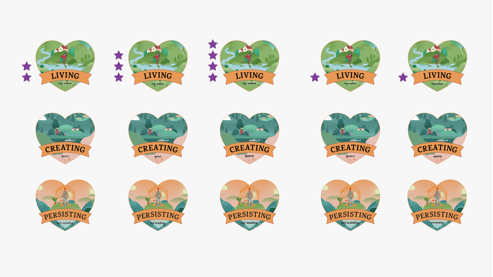
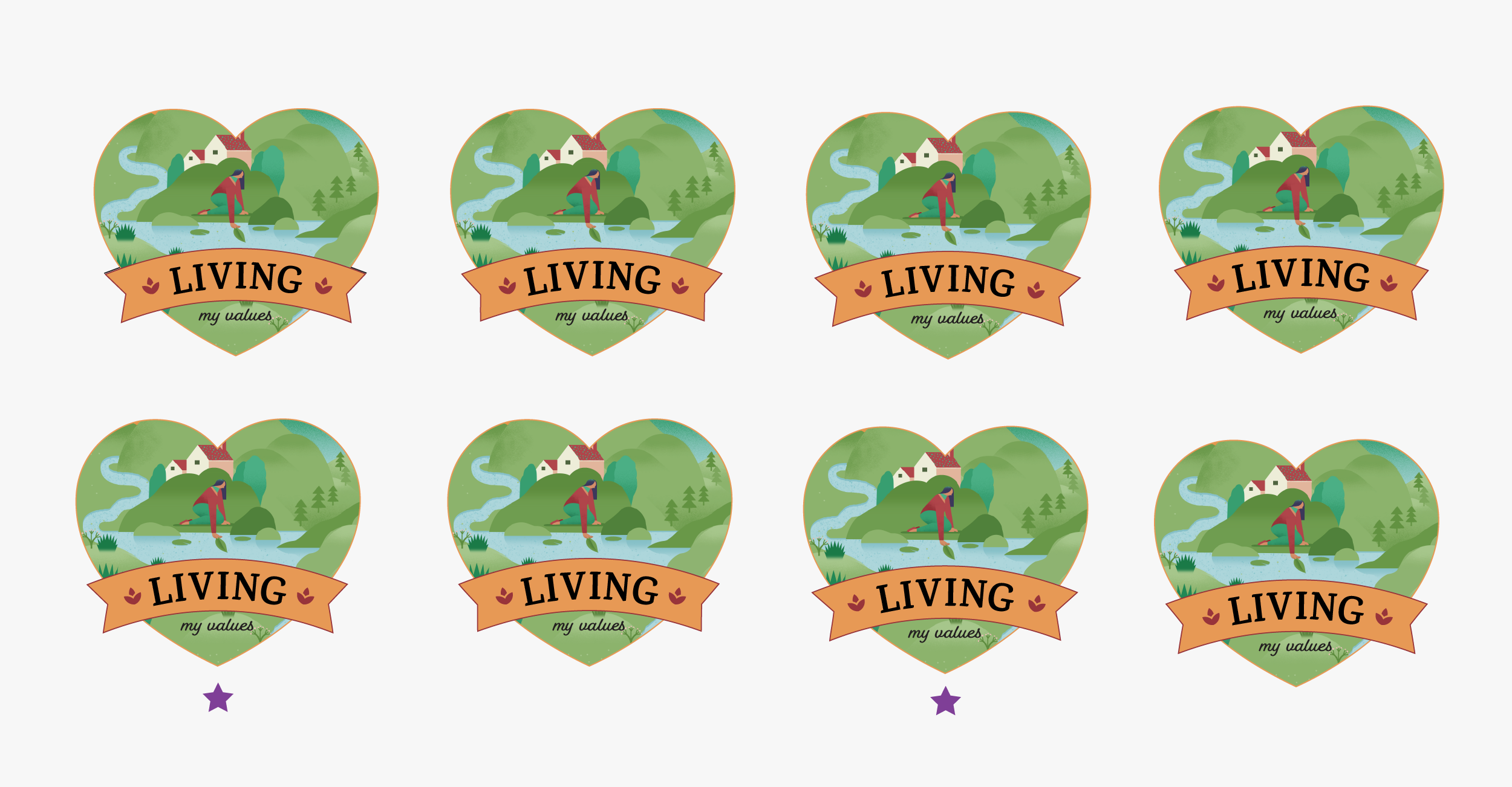
I collaborated with the Marketing Director on the copy and brought Stanza's personality to life by featuring the beautiful illustrations patients interact with while using the app.
BEFORE

PREVIOUS APPLE STORE GRAPHICS
AFTER

NEW APPLE STORE GRAPHICS
FINAL DESIGN

FINAL APPLE STORE GRAPHICS FOR STANZA

STANZA T-SHIRT
STANZA SWAG
Overview
Setting
We wanted thank our advisory board patients and the Swing Tx team for their important contribution to Stanza by gifting them a Stanza inspired t-shirt.
Problem
My challenge was to create a design that was on-brand, inclusive, and worked across T-shirt sizes as quickly as possible.
Approach
I quickly took this project from concept to production, honoring the different design phases design, without compromising design quality.
My Process
DESKTOP RESEARCH
Inspiration board
I started the project by looking at samples of T-shirt graphics and creating a quick and small inspiration board.
Vendor research
I like to select the vendor right at the beginning of a project so I can be aware early in the process of any constraints. After comparing printing methods, prices, turnaround times, delivery fees, and customer service, I selected the vendor that worked best for us.

INSPIRATION BOARD & VENDOR INFO
EXPLORING SOLUTIONS
Getting started
To stay on brand, I explored a direction that incorporated Stanza’s illustrations. I matched the visual treatment we used on the app stores graphics.
Designing, presenting, and iterating
I played around with different compositions and design elements, conducted design reviews, and facilitated discussions until I landed on a visual treatment that worked well. We had a direction but the copy/message needed further iteration.
Getting unstuck
I started exploring solutions that went beyond using the app name and tagline but was getting a bit stuck. I contacted a fellow teammate to pick her brain about possible copy/messaging. Her suggestions incorporated content from the app, so I further distilled them and weaved them into the designs.


ALIGNING ON A SOLUTION
Selecting the final direction
While incorporating the new copy and design elements, I came up with the idea of creating a series. We could start with the 1st design and print the other 2 at a later time.


FINE TUNING
Typography
In response to legibility issues feedback, I look for alternative scrips typefaces that would be more legible at first glance. I also adjusted the letter spacing and placement of the copy.
Graphic elements
I incorporated graphic elements from the Stanza design system, fine-tuned the shape and curb of the banner to fit the copy well.
Illustrations
I requested a higher resolution for printing and retouched it to work with the design.


T-SHIRT COLOR EXPLORATIONS
PRODUCTION
Selecting a t-shirt, brand, style, & color
I visited the printer to select a brand and style that would work well for all genders and body shapes. I initially selected a dark color t-shirt but then switched to a light color to avoid ending up with a thick graphic and keep the cost down.
Running a test
We tested the graphic to make sure it worked with the selected color and confirm the placement.
Looking at the proof
I visited the printer one more time to take a look at the proof and make sure the graphic and positioning looked good before printing all the t-shirts.
FINAL DESIGN


STANZA T-SHIRT FROTN & BACK